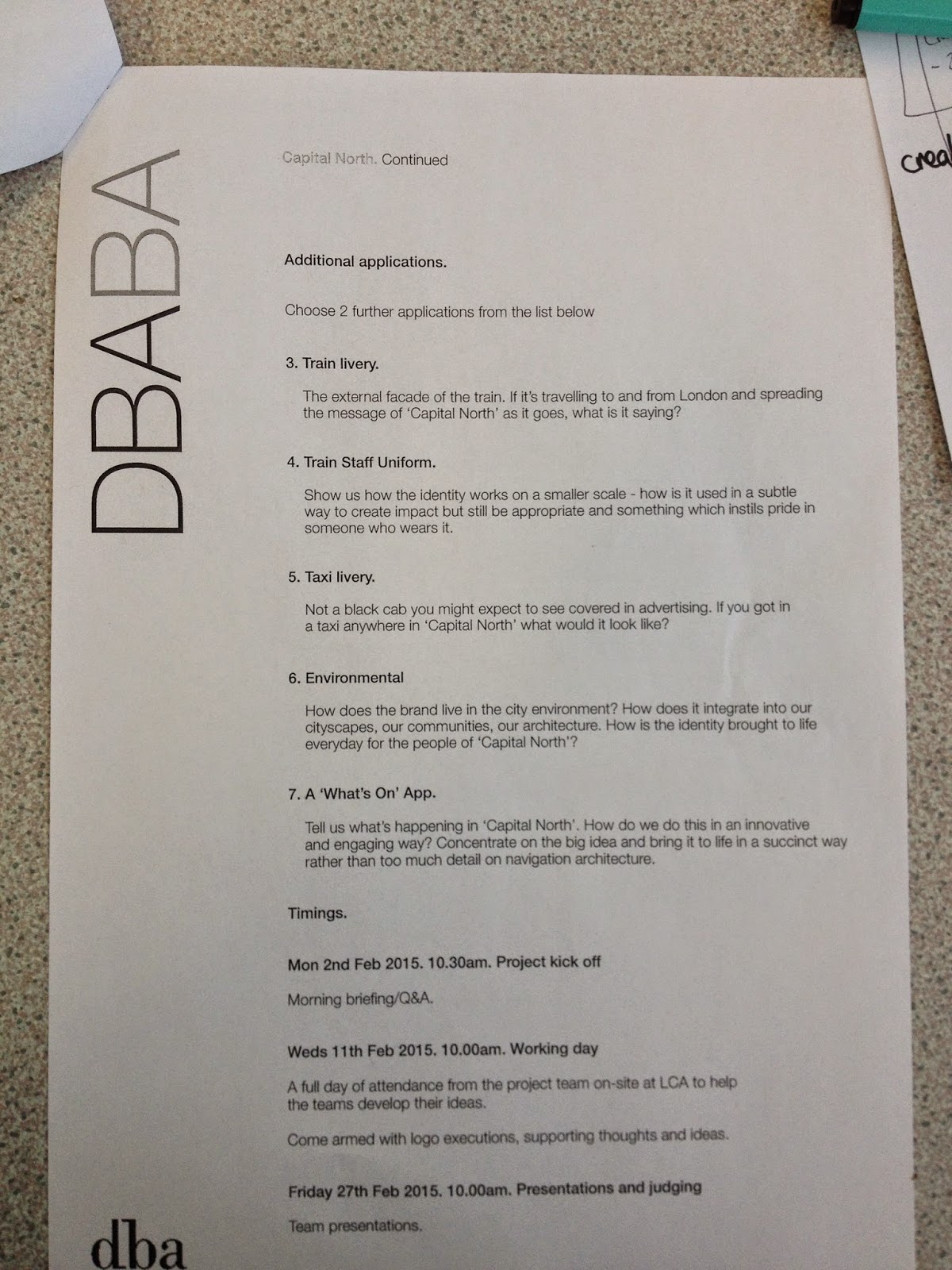
Brief:


Initial Thoughts:


To start off with we delegated a city to each person to research and get some general ideas. I was responsible for looking at Manchester. The main things I took from it were:
-Football
-Science
-Growing creative industries
-Industrial factories
-Four universites
-Rich in history/museums/galleries
Concept
We started to think about the concept and make some general points we want to communicate.
-Selling the idea of growth, connectivity and expansion-focus more towards the business side.
-Vibrant up and coming
-Buzz
-Four cities together are stronger
-Brother to London not rival
Key Words:
GROWTH
POTENTIAL / PROSPERITY
CONNECTIVITY
Friday Meeting 6.2.15
After our first meeting we went away and came up with some initial logo ideas for the first meeting. My ideas are below.

I wanted to communicate the four cities by using colours and shapes. I tired to communicate the idea of connecting and growth.


We presented our work to each other and discussed what ideas we thought could be developed further. Jordan suggested using a two colour scheme to represent the water and open spaces associated with the cities. We decided to go away and develop the ideas further for the next meeting.
Tuesday Meeting:

For the second meeting we developed some logo ideas to present to the group. Above are my ideas that I showed. There was good ideas from each person so we have put together a presentation ready for the crit on Wednesday.
Wednesday Crit:
We presented our work to the DBA members and got some really good feedback. It was suggested to use the icons as the visual language and further develop my logo that uses the star and lines. With this in mind we split up and developed our own ideas with the chosen logo as a base or starting point.

After some feedback we decided to go with the concept of the logo representing the northern star with negative space within the star that would resemble an N. We are meeting again on Friday with some further developed ideas.
Friday Meeting:
For the meeting I have developed the logo from the last session.


I have created a logo that reflects the northern star concept and represents each city through the different shades of colour.


We decided to print everyones logos and have a crit to make a decision on which one to use.


I have tried some different colour themes. The top line uses the shades of blue and green to represent the water and open spaces of the cities. The second line uses patriotic colours to represent a rose and the flag. The third line is abstract colours that have no representation. I personally like the large logo above but it will have to be a group decision.

For the purpose of development I have used the colours I think are best. I have started to experiment with the positioning of the type in the logo. I personally think the bottom left logo is the strongest as it naturally follows the direction of the negative space N within the logo.

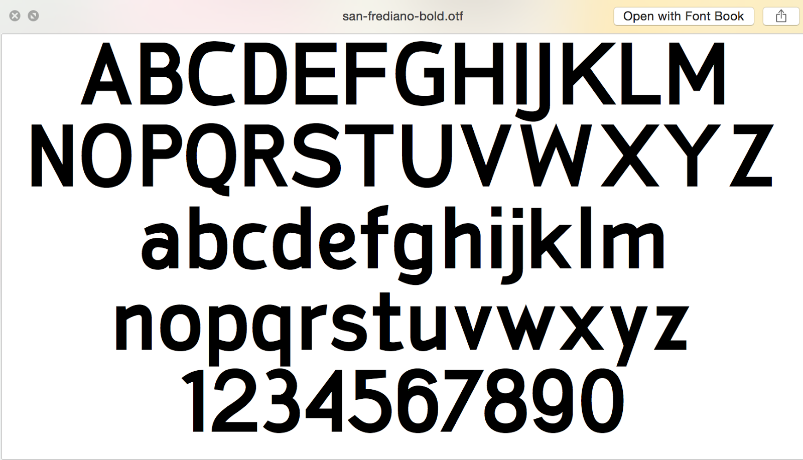
I have been trying out different fonts. My thinking is finding the balance between a font that appeals to business and tourism. I like the font san-frediano bold so it will interesting to see what the others think in the next meeting.


Wednesday Meeting:
Today we had a meeting and presented where we were with ideas.

Above was Jane's logo colours and font choice. It was similar to one of my colour schemes so we decided to use greens and blues for the colours to represent the two water cities and inland cities.


The colours above are the final colours we decided to go with and we will be using Gill Sans for the typeface as it is an English typeface which we felt was appropriate for the brand.


Final Logo:

Typeface:

Colour Scheme:


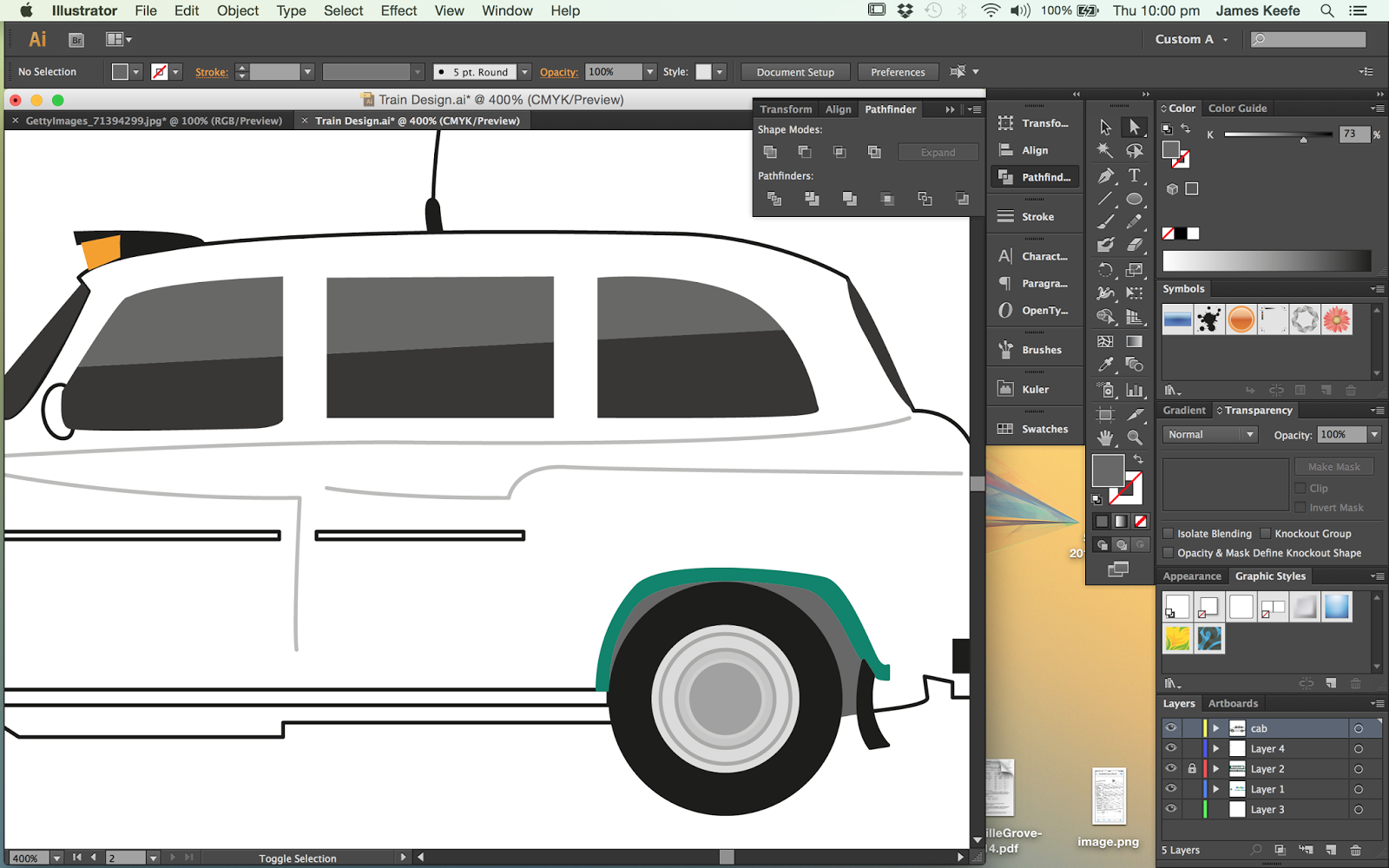
After our meeting I am going to mock up the train design.


I didn't want to use a real image of a train because I think it never looks good enough quality so I have created my own illustrator image to mock the design up.


I have used the logo to create the pattern with the four colours to show the connection between the cities.


Next I made the connecting carriage that uses the same pattern but has the names of the four cities to make it clear to people traveling from London and within the northern cities.
Final Design:

I am also going to apply the design to taxis and buses as this is the most used means of transport that the target audience will use. Its also means the brand is advertised around the city constantly to reach a larger audience.


To design follows the train design for constancy.


We decided to display the logo on the roof of the car so Business and people working in taller building will be able to see the logo.


Final Design:


I removed the sky as it was really dull and replaced it with a blue sky image to make it more appealing.


To mock it up I had to cut round the sculpture and impose it onto a stock image of Leeds centre.

Final Images:


-Vibrant up and coming
-Buzz
-Four cities together are stronger
-Brother to London not rival
Key Words:
GROWTH
POTENTIAL / PROSPERITY
CONNECTIVITY
Friday Meeting 6.2.15
After our first meeting we went away and came up with some initial logo ideas for the first meeting. My ideas are below.
I wanted to communicate the four cities by using colours and shapes. I tired to communicate the idea of connecting and growth.
We presented our work to each other and discussed what ideas we thought could be developed further. Jordan suggested using a two colour scheme to represent the water and open spaces associated with the cities. We decided to go away and develop the ideas further for the next meeting.
Tuesday Meeting:
For the second meeting we developed some logo ideas to present to the group. Above are my ideas that I showed. There was good ideas from each person so we have put together a presentation ready for the crit on Wednesday.
Wednesday Crit:
We presented our work to the DBA members and got some really good feedback. It was suggested to use the icons as the visual language and further develop my logo that uses the star and lines. With this in mind we split up and developed our own ideas with the chosen logo as a base or starting point.
After some feedback we decided to go with the concept of the logo representing the northern star with negative space within the star that would resemble an N. We are meeting again on Friday with some further developed ideas.
Friday Meeting:
For the meeting I have developed the logo from the last session.
I have made a quick gif to show the group to illustrate how the logo represents the concept and how it could be made to move in the final presentation.
We had two each to select the logos we felt were strongest. It came down to two logos and in the end we decided to use my logo for the final design.
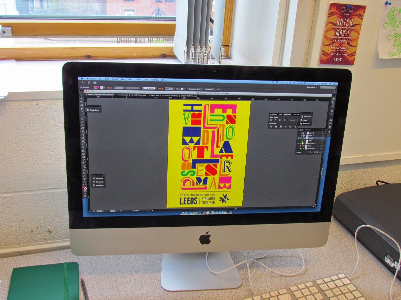
Now we have the logo we need to decide on fonts and colour schemes. We have decided to delegate jobs now to utilise time. Me and Jane will be testing type and colour choices for the logo and the other guys are starting to think about the posters.
I have tried some different colour themes. The top line uses the shades of blue and green to represent the water and open spaces of the cities. The second line uses patriotic colours to represent a rose and the flag. The third line is abstract colours that have no representation. I personally like the large logo above but it will have to be a group decision.
For the purpose of development I have used the colours I think are best. I have started to experiment with the positioning of the type in the logo. I personally think the bottom left logo is the strongest as it naturally follows the direction of the negative space N within the logo.
I have been trying out different fonts. My thinking is finding the balance between a font that appeals to business and tourism. I like the font san-frediano bold so it will interesting to see what the others think in the next meeting.
I started thinking about how we can communicate the three key words in are brand qualities:
/Growth
/Connectivity
/Potential
I have used the N that is created within the negative space in the logo with the city names. Ive had an idea to use the icons Jordan created before in the gaps to represent different elements of the cities. This has the scope to then be turn into something moving to create a visual language.
Moving Logo:
Wednesday Meeting:
Today we had a meeting and presented where we were with ideas.
Above was Jane's logo colours and font choice. It was similar to one of my colour schemes so we decided to use greens and blues for the colours to represent the two water cities and inland cities.
Above is Jordan's development. We liked his use of the logo shapes to make up the map of the UK with the logo near the North. We decided that his could be further developed into a moving advertisement that could be displayed at train stations etc.
The colours above are the final colours we decided to go with and we will be using Gill Sans for the typeface as it is an English typeface which we felt was appropriate for the brand.
Final Logo:
Colour Scheme:
C-100
M-22
Y-69
K-0
C-47.03
M-0
Y-53.66
K-0
C-68.38
M-0
Y-81.96
K-0
C-70.02
M-14.05
Y-4.52
K-0.03
C-84.23
M-45.46
Y-0
K-0
After our meeting I am going to mock up the train design.
I didn't want to use a real image of a train because I think it never looks good enough quality so I have created my own illustrator image to mock the design up.
I have used the logo to create the pattern with the four colours to show the connection between the cities.
Next I made the connecting carriage that uses the same pattern but has the names of the four cities to make it clear to people traveling from London and within the northern cities.
Final Design:
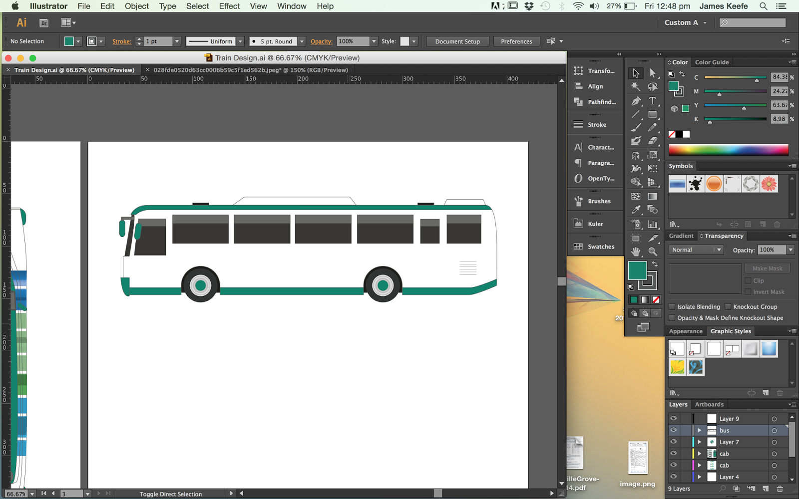
I am also going to apply the design to taxis and buses as this is the most used means of transport that the target audience will use. Its also means the brand is advertised around the city constantly to reach a larger audience.
To design follows the train design for constancy.
The taxis will have the names of the cities on the side.
We decided to display the logo on the roof of the car so Business and people working in taller building will be able to see the logo.
The final transport element will be buses as this will target the residents and local community.
Final Design:
Sculpture:
We decided to photograph the sculpture that Jane made. It was my job to edit them and I will try to mock it up within the environment to show how it would work.
I removed the sky as it was really dull and replaced it with a blue sky image to make it more appealing.
To mock it up I had to cut round the sculpture and impose it onto a stock image of Leeds centre.
Final Images:
No comments:
Post a Comment