The Brief:
Last year I crated a logo for this company which is below. They have got back in touch with me and asked if I can create a new logo for them as they were having troubles getting the logo trade marked so they need a new one under the name GULP. They only require a logo so this will be a quick brief.
Original Logo:
The client wants to keep the original packaging graphics and colour ways for each product do the logo will need to work with them and translate to the colour variations.
Packaging Graphics:
Initial Ideas:
The original logo used fruit within the design so I wanted to continue this theme with the new logo. I have sketched some initial ideas, I think it will use the fruit segments somehow.
Digital Development:
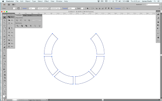
I experimented with vectors to create a power symbol with the middle reflecting a juice droplet. Im to sure if I like this as it looks a bit dated so i will keep expanding my ideas.
I thought about crating my own font but I decided against it in the end as it was taking to much time and i found some good fonts to expand on that were available for commercial use.
I started to experiment with the graphic and type. I decided to scrap the design above as I felt the font wasn't working.
I tried the font above which I think is much better for the purpose and suits the brand and products. I like the droplet but it looks realistic so insure if its the best solution for a logo.
I think the design above had potential. Its simple and clean which i think reflects electronics and tech quite well.
I have displayed the logo with the colour ways to see how it translates. I like this design and will present it to the client.
I felt the G need to be more legible so I have taken the ascender from a different font and combined them. I think this design could be the strongest as its playful and works well with the graphics and the strap-line sits better within the logo.
I will submit this design swell so the client has a variety to choose from.
Pitch Boards:
Above are the logos that I pitched to the client. Below I have showed the colour variations and how it translates on a black background.
When I sent the designs I suggested to the client that I felt number 4 was the strongest logo and i thought it would be the best deign to use. They agreed with me which was nice because they value my opinion and listen to my advice as a designer which isn't always the case.


No comments:
Post a Comment